- INTERFACE TYPE
- Conversational AI
- INDUSTRY
- Enterprise
- AGENCY
- Fuselab Creative
- PROJECT STAGE
- Not independently confirmed
The problem and context
Stardog Voicebox is a conversational AI workspace for financial analysts. A user asks a question about fund data in plain language and receives an AI-generated answer. Fuselab Creative reports that it designed the complete UI/UX for the product, including a refreshed design system. The client quote on the agency’s page describes the brief as a new application experience for a business persona: someone who needs insight from their data but is not a data specialist. Fuselab Creative’s original account.
This examination looks at how the interface handles three problems that most analytical AI products share: what to do with an empty prompt, how to let people check an answer, and how to keep research findable after the conversation ends.
The constraints
Two constraints shape the work. First, a language-model answer cannot be trusted on its own in a financial setting; the analyst has to be able to see where it came from. Second, the users are domain experts in finance, not in the system’s data model. The interface therefore has to explain what it knows without asking people to learn query syntax.
Design decisions worth examining
1. Answer the cold-start problem before the first question
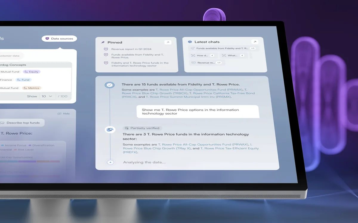
Fuselab describes an entry screen that shows dataset context, ready-made prompts, pinned resources, and recent conversations on first load. Fuselab Creative’s original account.
Our reading: a blank chat box tells a new user nothing about scope. Showing the available data and a few example questions communicates what the system can answer before the user has to guess. Recent conversations do a different job: they let a returning analyst pick up where they stopped. The two needs are distinct, and the screen serves both without making the newcomer wade through history.
What to watch for: suggested prompts only help if they lead somewhere useful. A prompt that replays a polished demo can set expectations the real data cannot meet.
2. Put the answer next to the data it came from
The core layout is a split panel: a structured fund-data table on one side and the AI conversation on the other, in the same viewport. Each exchange is kept in a dialogue timeline. Fuselab Creative’s original account.
Our reading: this is the most transferable decision in the project. When the source table stays visible, checking an answer becomes a glance rather than a separate task in another tool. Proximity is not proof, though. A reader still needs to know which rows support which claim, and the published material does not show whether answers link to specific records.
3. Make uncertainty visible without making it alarming
Fuselab reports verification markers on each AI response that separate high-confidence answers from those that warrant manual review. The agency frames the design problem as calibration: markers that are too loud undermine trust in every answer, while markers that are too quiet get ignored. Fuselab Creative’s original account.
Our reading: the framing is right, and it is a useful way to critique any AI interface. A confidence label is still a summary of the model’s own judgement. It should lead the analyst to the evidence, not replace it.
Supporting details
The account also describes radar charts for comparing funds across normalized attributes, a full-screen mode combining bar and donut charts, a personal workspace with pinned conversations, and a conversation library where each thread stays linked to its documents and data sources. The last of these addresses a common failure: insights that leave the tool as copied text lose the evidence behind them.
Contribution, outcomes, and evidence
Documented contribution: UI/UX design, interaction design, 3D illustration, and a design system, as stated by Fuselab. Stardog’s product and engineering teams built and operate the product; the agency page does not describe the build.
Outcomes: Fuselab’s page reports increases in user engagement time and new-user conversion after the redesign. It does not state the measurement period, baseline, or method, so we do not repeat the figures as results. The client quote supports that a design-system and application engagement took place and that Stardog engaged the agency again.
What we did not verify: we have not used the live product, checked answer accuracy, or confirmed how verification markers are calculated. Everything above about features comes from the agency’s account; the “Our reading” passages are our interpretation of that account and its images.
A practical lens
- Steal the split view. For any AI tool that answers questions about a dataset, keep the dataset on screen. It is cheap to build and changes how people check answers.
- Design the first screen for both newcomers and returners. Example prompts and recent work solve different problems; give each its own space.
- Treat confidence markers as a route, not a verdict. The next step after “check this” should be one click away.
Where this may not transfer: the pattern assumes a structured table that fits on screen beside a chat. For unstructured sources such as long documents or images, the evidence needs a different presentation, such as cited passages or highlighted regions.
Original source and editorial responsibility
Source: Fuselab Creative’s original account, checked 16 November 2026. Written by Best UX Portfolios from the agency’s published case study and images. We have not tested the live product or interviewed the client. Spotted an error? Request a correction.