- INTERFACE TYPE
- Conversational AI
- INDUSTRY
- Travel
- AGENCY
- Fantasy
- PROJECT STAGE
- Released product (launched November 2025, per agency account)
The problem and context
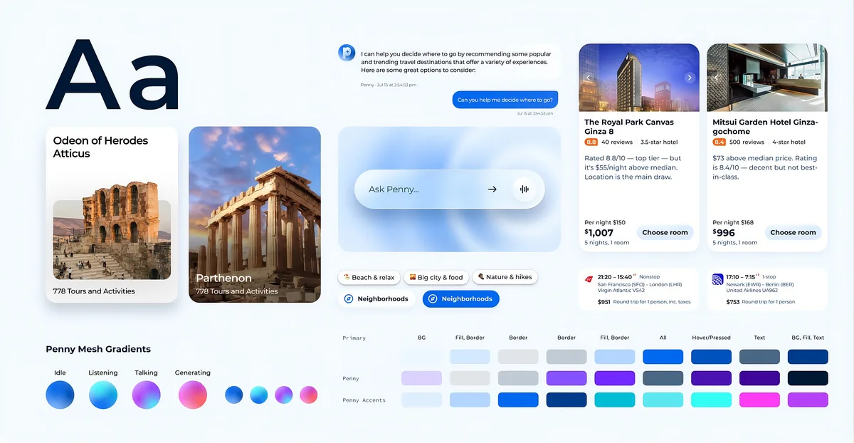
Penny is Priceline’s AI travel assistant. It answers travel questions, finds hotels, and helps travelers sort out problems with bookings. Fantasy reports that Penny was already serving more than three million travelers when Priceline decided to upgrade the experience, because the interface “still looked and felt like every other chatbot in travel.” Fantasy’s original account.
Over eight weeks, Fantasy designed a brand and motion identity meant to move Penny from a feature inside the Priceline app toward a travel assistant with its own identity. This examination looks at one idea at the center of that work: treating an AI agent’s delays and uncertainty as something to design for, not hide.
The constraints
Fantasy names three properties of an AI travel agent that a normal interface struggles with. It does not respond instantly. It does not always sound certain. And it does not have the same abilities from one week to the next, because new capabilities keep arriving. Any visual system has to survive all three, and Priceline’s team had to be able to extend it on their own.
Design decisions worth examining
1. Give every state of the assistant its own visual cue
Fantasy describes an avatar with distinct passive, listening, thinking, and generating states, so travelers can see what Penny is doing at each moment. The agency frames the goal as turning “Penny’s stuck” into “Penny’s working on it.” Fantasy’s original account.
Our reading: this is the most transferable idea in the project. A plain loading spinner says only “wait.” A visible difference between listening and thinking tells a person whether the assistant heard them, which is the question people actually have when a chat goes quiet.
What to watch for: expressive states only help if they are honest. An animation that says “thinking” while the system is actually stalled would damage trust faster than a plain spinner.
2. Use motion to fill waiting time with progress
The account describes “orbflow” motion patterns, a budget-to-luxury slider, and card-generation animations that give travelers “a running sense of what Penny is doing while it works.” Fantasy’s original account.
Our reading: generating results card by card shows progress instead of a blank wait, and a slider lets a traveler shape the request while results come in. Both turn delay into something the traveler can watch or adjust.
What to watch for: motion that runs during every wait can become tiring on repeat visits, and it needs a reduced-motion alternative. The published material does not show how either is handled.
3. Make “no exact match” a next step, not a dead end
Fantasy reports that when Penny cannot find an exact match, the response is written to keep the traveler moving toward a booking rather than ending the conversation. Fantasy’s original account.
Our reading: failure states are where chatbots most often lose people. Treating “nothing found” as the start of a better search, with alternatives and a way forward, is a habit worth copying in any assistant.
Supporting details
Fantasy describes the identity as modular: the avatar’s behaviors, motion rules, and a Figma toolkit are structured so Priceline can apply them to any flow and extend them as Penny gains abilities. Seasonal moments such as Cyber Week were planned in from the start.
Contribution, outcomes, and evidence
Documented contribution: brand identity, motion design, the expressive interface language, and a design toolkit, over eight weeks, per Fantasy. Priceline built and runs Penny; the underlying AI and booking technology are Priceline’s.
Stage: Fantasy reports that the redesigned Penny launched in November 2025 and that Priceline deployed the system to the Penny Portal.
Outcomes: the page cites figures from Priceline and others: travelers saving nearly ten minutes per trip compared with contacting customer support, an uplift among users who engage with Penny, and an independent analyst ranking of Penny’s booking experience. These describe the Penny product as a whole. They are not attributed to the visual and motion work specifically, so we do not treat them as design results.
What we did not verify: we have not used Penny or measured its behavior. Feature descriptions come from Fantasy’s account; the “Our reading” passages are our interpretation of it and its images.
A practical lens
- Name your assistant’s states. List every moment between the user’s message and the answer, and give each one a visible signal.
- Show progress, not just waiting. Build results up piece by piece where you can.
- Design the failure message first. Decide what “no result” leads to before polishing the success case.
- Build the system to grow. If the assistant’s abilities will change, its visual language has to absorb new features without a redesign.
Where this may not transfer: a playful, expressive personality suits consumer travel. In banking, healthcare, or legal tools, the same states may be better expressed more quietly, with clear text labels in place of character animation.
Original source and editorial responsibility
Source: Fantasy’s original account, checked 17 November 2026. Written by Best UX Portfolios from the agency’s published case study and images. We have not tested the live product or interviewed Priceline. Spotted an error? Request a correction.